Website Redesign
Scottish House Members' Business Centre
Project Overview
Client / Brand: Scottish House Members’ Business Centre
Role: Lead Designer (Content, Re-Branding & UI/UX)
Duration: 3 months
Tools Used: Illustrator, Photoshop, WIX
_______________________________
The Brief -
Scottish House is one of Melbourne’s most iconic vintage buildings, established in 1907 by architect Charles D’Ebro. Over its 118 years, it has witnessed Australia’s business history across shipping, mining, and investment industries. The challenge was to digitally transform this legacy brand while retaining its timeless essence. The goal was to modernise the website, improve usability, and encourage engagement, all without losing the company’s historic character.
_______________________________
The Problem -
1. Outdated website design lacked brand clarity.
2. Navigation was cluttered and left visitors unsure of where to go.
3. No clear call-to-action (CTA), leading to compromised reach.
4. Website was not mobile-friendly, excluding a large segment of users.
5. Inconsistent design language diluted the sense of exclusivity and prestige associated with the brand.
OLD WEBSITE IMAGES
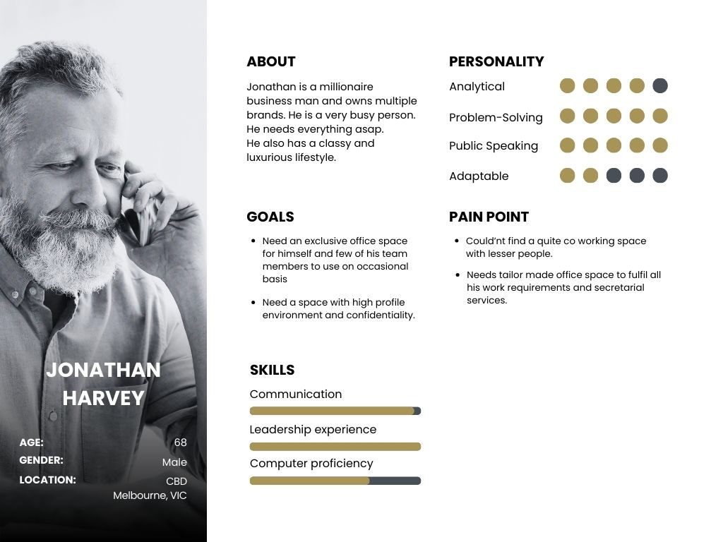
User Persona
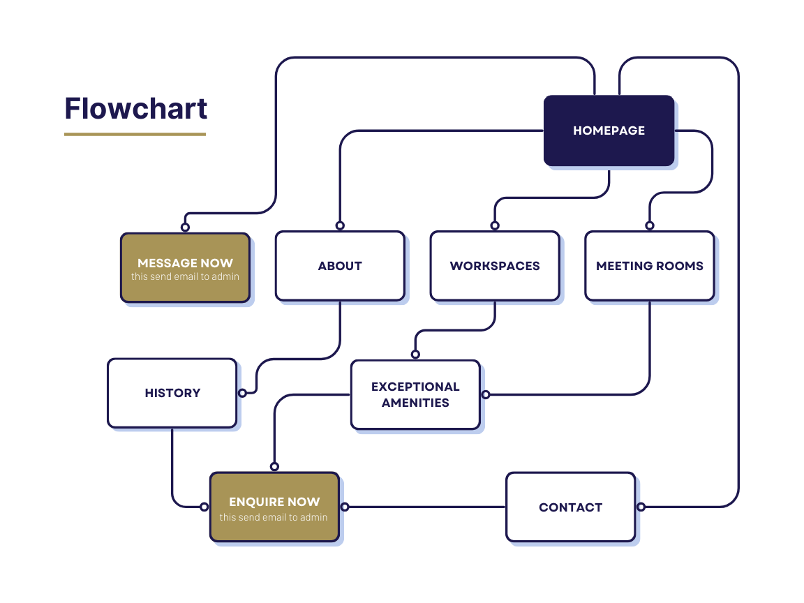
User Journey Mapping (Resolution)
_______________________________
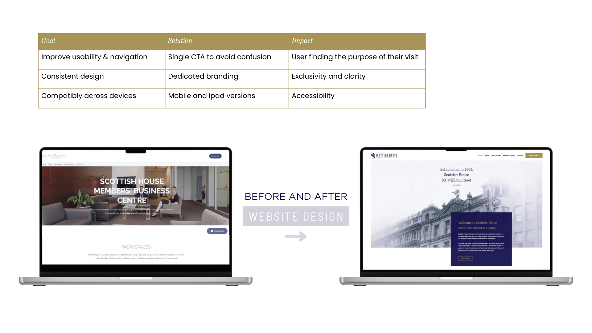
The Goals -
1. Improve usability & navigation so visitors can easily find information.
2. Establish a single, prominent CTA to drive member enquiries.
3. Align digital branding with the heritage and prestige of Scottish House.
4. Ensure cross-device compatibility (desktop, mobile, iPad).
5. Make the website feel exclusive, timeless, and elegant while still functional.
_______________________________
The Process -
1. Research & Brand Study: Analysed Scottish House’s history, building architecture, and legacy to craft a design language blending vintage heritage with modern minimalism.
2. Information Architecture: Streamlined navigation into simple, clear pathways with one major action point (CTA: Message / Enquire).
3. Wireframing & Prototyping: Created responsive wireframes to ensure smooth usability across devices.
4. UI Design: Focused on clean typography, muted vintage tones, and structured layouts to communicate exclusivity and timelessness.
5. Testing & Iteration: Tested layouts with stakeholders and refined the CTA placement, ensuring clarity and focus.

Keyword "Enquire Now" changed to "Message Now" on the homepage for slight casual approach psychologically to enhance visitor reachability.
_______________________________
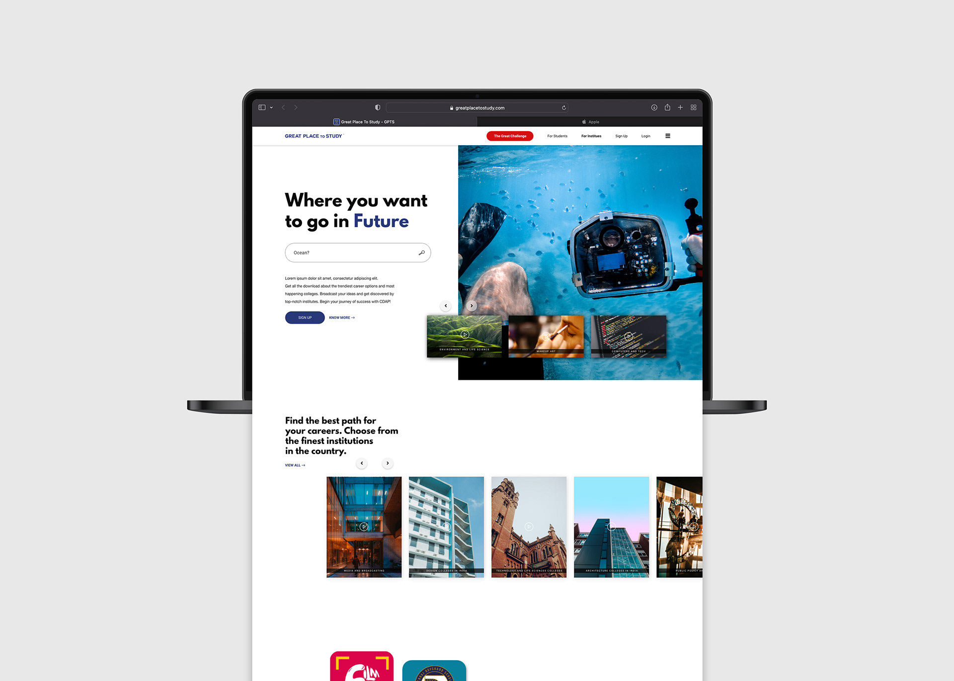
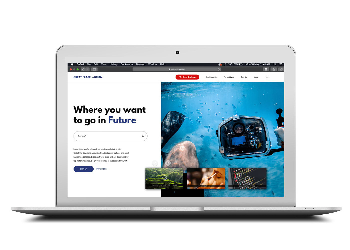
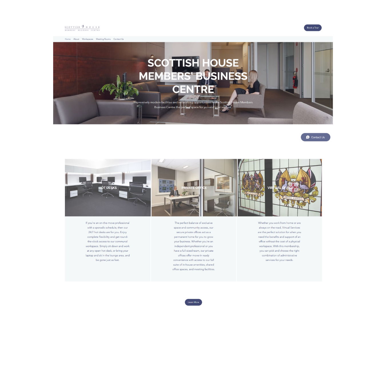
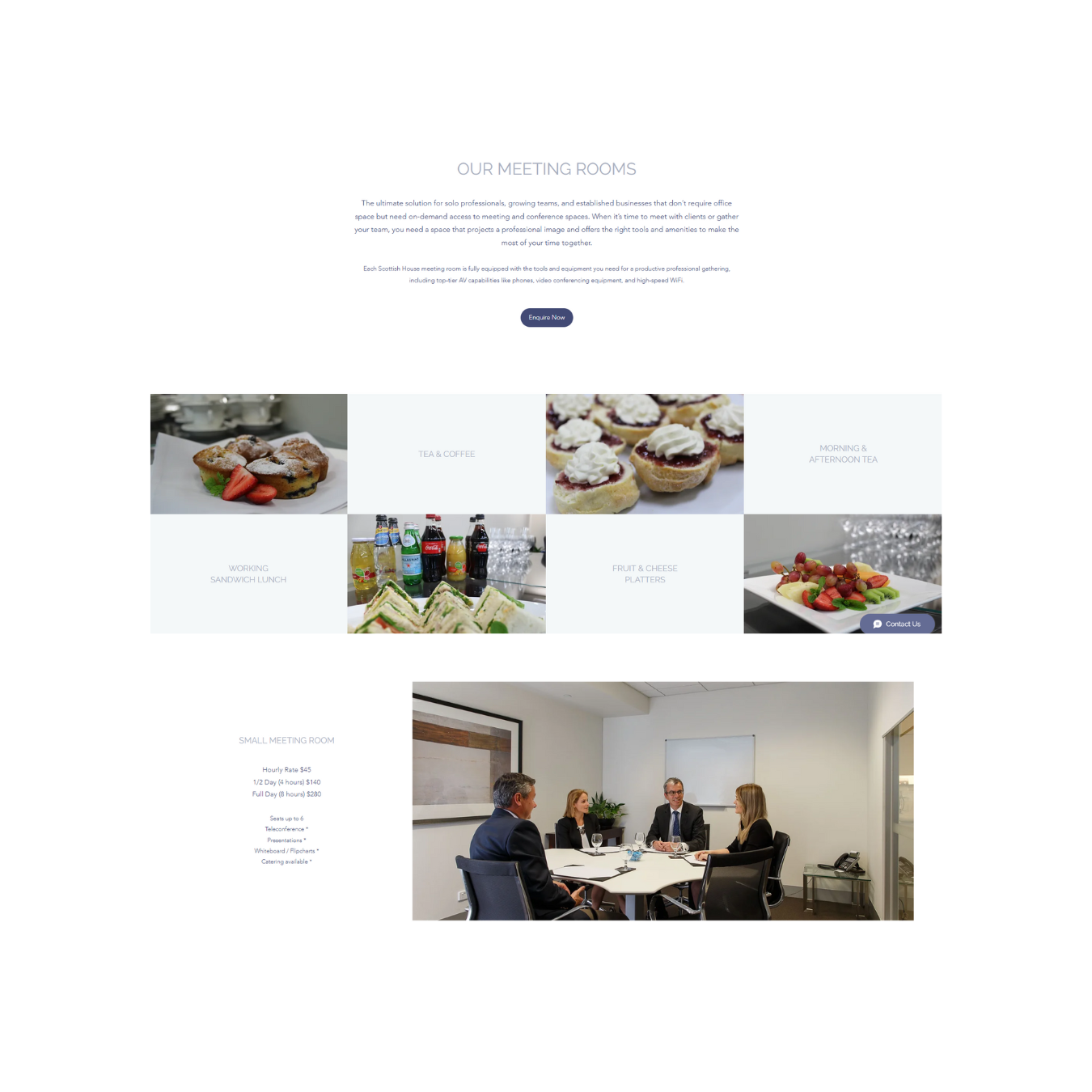
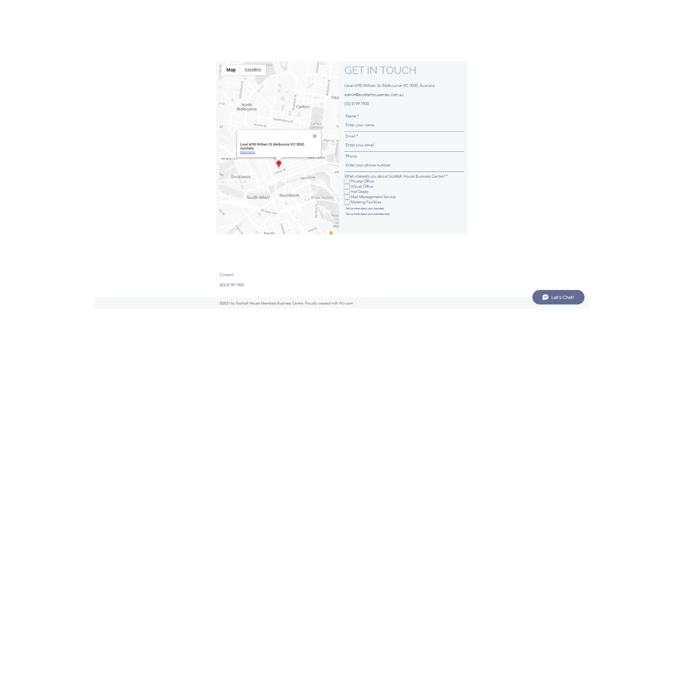
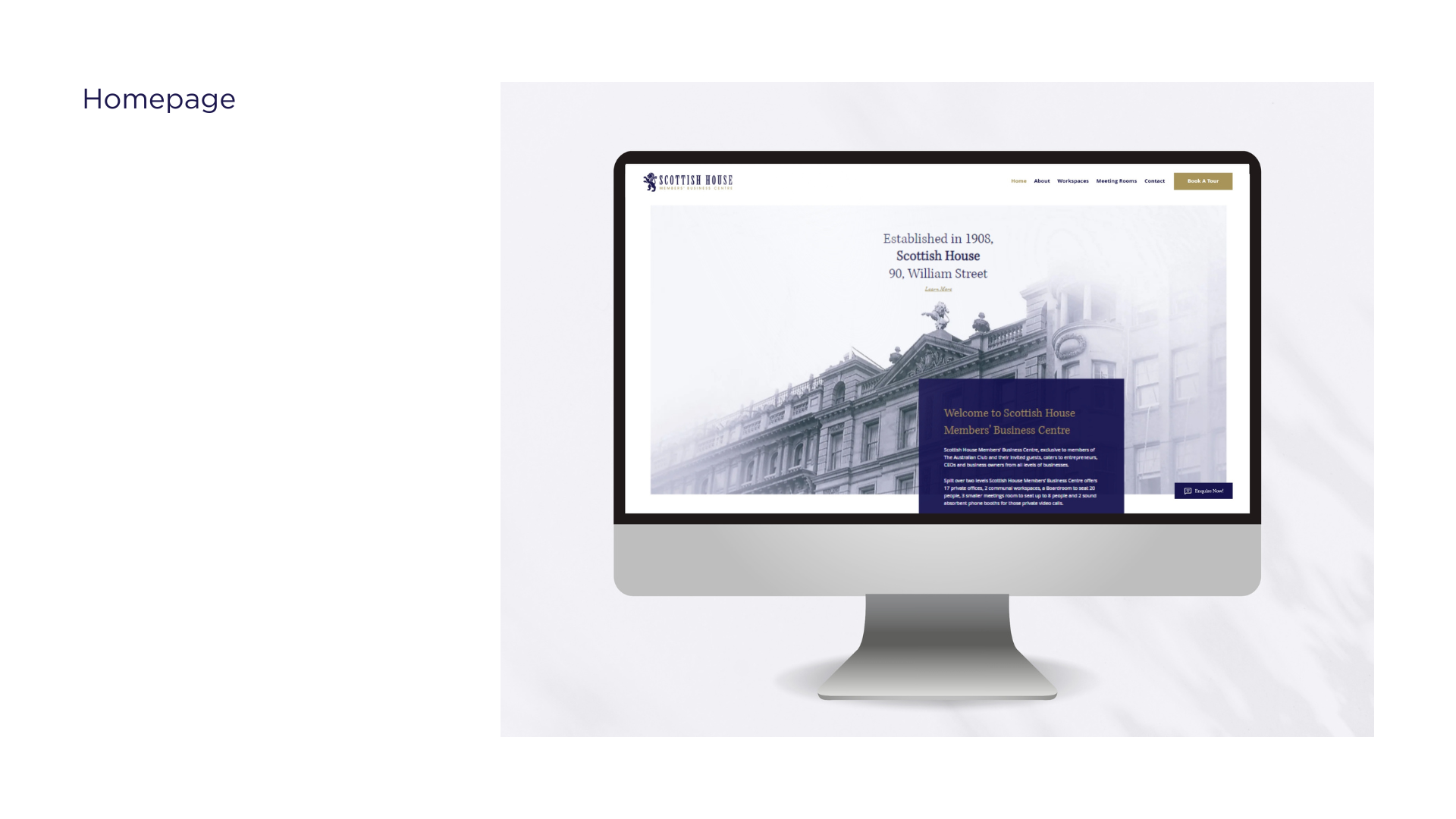
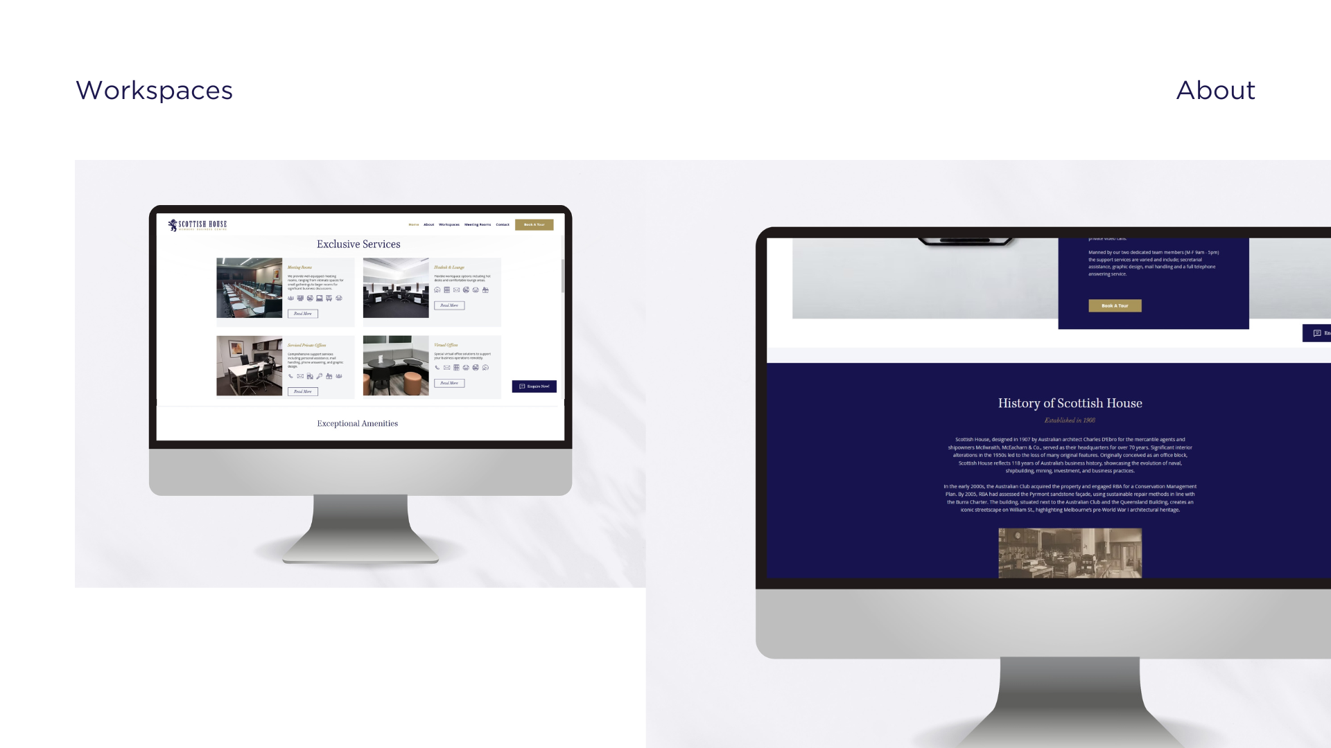
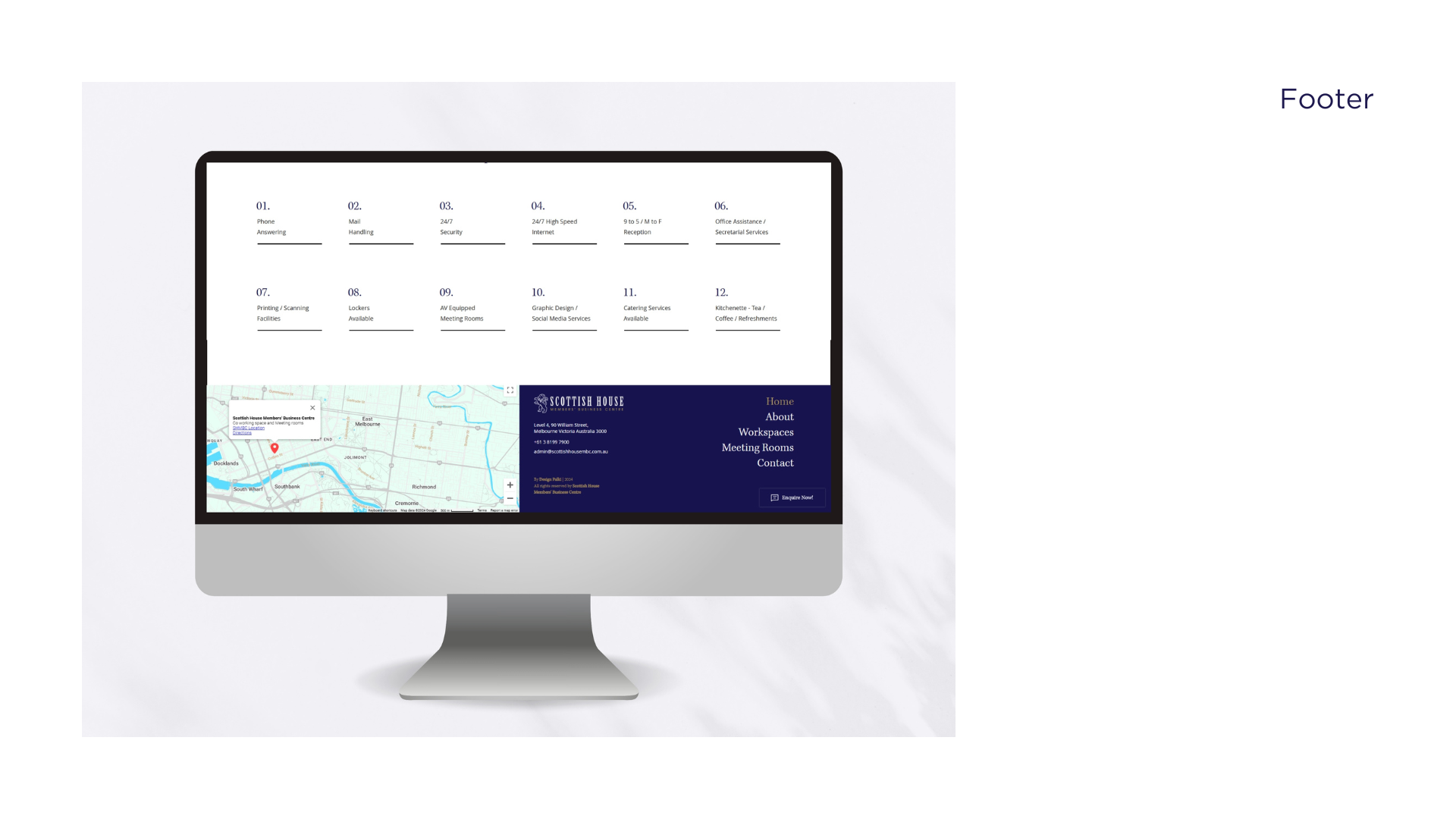
The Solution -
1. Consistent Design System: Unified fonts, colours, and visual hierarchy across all pages.
2. Single CTA Strategy: Simplified user journeys by highlighting one main action per page.
3. Responsive & Accessible: Designed mobile-first layouts, ensuring accessibility and smooth performance across devices.
4. Exclusivity & Clarity: Subtle design details, heritage-inspired branding elements, and timeless typography gave the website its unique “vintage essence.”
NEW WEBSITE IMAGES
_______________________________
The Impact -
The redesign not only modernised the digital presence of Scottish House but also delivered measurable results:
1. Site Sessions: ↑ 111%
2. Unique Visitors: ↑ 107%
3. Clicks to Contact (CTA): ↑ 186%
These results proved that the blend of heritage-focused branding and modern usability successfully engaged users and increased conversions.
Reflection
By focusing on clarity, usability, and a single-point CTA, I learned how powerful simplicity can be in guiding users towards meaningful engagement and final conversions.
To view live website: www.scottishhousembc.com.au
To work with me: https://designpalki.com/contact